When it comes to running sweepstakes and contests, achieving the highest conversion rate possible should be one of the most important goals for your campaign.
With a low conversion rate, your campaign is potentially missing out on thousands of entries for a variety of different reasons—reasons that you had no way of testing, until now.
Let’s face it, we spend a lot of time setting up, tweaking, and creating beautiful campaigns, but who really knows if that campaign will get the best response when traffic is being driven to the page?
What if a blue button increased your conversion rate by 5% instead of a green button? What if using a different image than the one you’re currently using bumped your conversion rate 10%?
That would mean out of 1,000 entries, you would be missing out on 100 people. On 10,000 entries, you would be missing out on over 1,000 people!
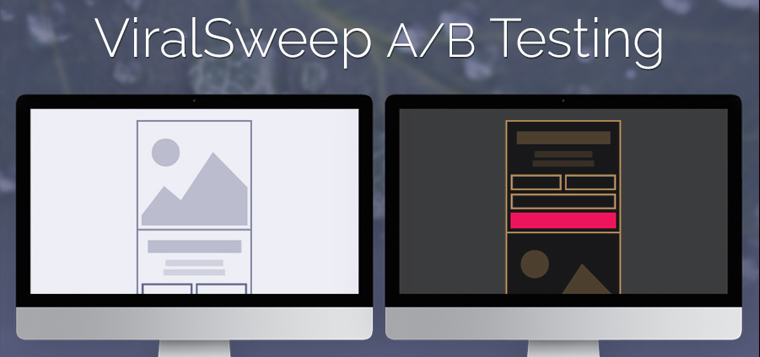
This is where A/B testing becomes a powerful tool. With an A/B test, you can create different versions of your campaign and change any variables you would like, split traffic between those campaigns, and see which one is bringing in the highest conversion rate.
Usage
Check out this in-depth overview of our A/B Testing feature:
With our A/B testing system, you can currently duplicate your campaign as many times as you want to create multiple variations of it and change any of the following items:
- Campaign Title
- Campaign Description
- Form fields (add or remove any fields on the entry form)
- Images (add or remove any images or show no images)
- Themes (change the theme a campaign is using)
- Custom CSS (change any CSS variables as part of your tests)
- Language (change what anything says on the app)
- Formatting (change form widths, image positions, button colors)
Variables to test
Here’s a list of different variables to consider testing when using the A/B testing tool.
1) Button Text
Change the text on the button from ‘Enter’ to something that will entice your entrants to click through. For example, if you are awarding bonus entries on the next page, change the text on the button to say ‘Enter & Get More Entries!’


2) Button Colors
Changing the color of your CTA button can drastically improve your conversion rate.
Keep in mind though, most studies show the color itself doesn’t exactly improve the conversion rate, but how that color contrasts with the overall page it is contained in. Try different variations of colors on your page that both blend in and stand out to see which performs better.
Keep in mind, you can also change the color of the text on the button, so work to find the best color combinations.


3) Campaign Title + Description
The title or description of your campaign is typically the first thing people will see when they land on your page, other than the images. Test multiple title or description variations to find which one brings the highest conversion rate.


4) Form Fields
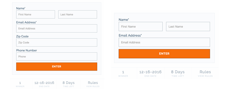
If you have a lot of fields on your entry form, try creating a variation that limits the form to just one or two fields, like name and email address.
Reducing the number of fields for people to complete can drastically improve your conversion rate because the barrier to entry is greatly reduced.

5) Images
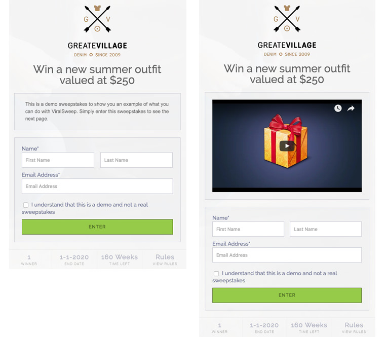
The images on your campaign are one of the main variables that contribute to your conversion rate. If people cannot see or easily visualize what it is they can win through the images you provide, it may be affecting your conversion rate.
Test different images to see which combinations work best.
6) Video
Adding video to your entry form instead of images or a long text description is another variable that can be tested. Sometimes people just don’t want to read, but would prefer to watch a short video instead.
For your campaigns, you can upload a video talking about the prizes and how to enter, and create a variation containing the video and see how well that performs against images or a text description.

7) Themes
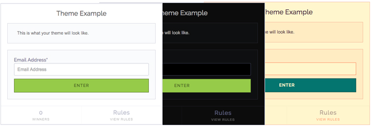
Changing the colors of the campaign to help it stand out and grab the users’ attention can help improve the conversion rate.
For example, if you create a custom landing page and embed our widget onto it using the default style, then you use a custom theme that looks like a native part of your site, you may see a difference in conversion rate.

Things To Remember about AB Testing
Keep these few key things in mind when running an A/B test:
- If your traffic is already low, or you don’t anticipate receiving many entries, then running an A/B test probably won’t help you find a significant result.
- If your traffic is low, keep the amount of variations you create to a minimum. Remember, with every variation you create traffic is being split (based on what you set the frequency to). So if you have 10 variations and are splitting traffic evenly amongst 10,000 visits, each variation would only see 1,000 visits. Instead, one variation measured against your baseline would allow each variation to receive 5,000 visits, producing a much more significant result.
If you have any questions or comments about the new A/B Testing feature, please leave them in the comments below.





Sweepstakes vs Contest: Differences and Benefits - ViralSweep
[…] the contest. To motivate participants, most contests have a short deadline and take advantage of A/B testing to make sure the contest is truly […]