This is Part I of a new weekly series where we will review a random sweepstakes or contest; tearing it down to share our analysis, telling you what was great about it, what areas need improvement, and what changes can be made to increase conversions.
We have no affiliation with the brands that we feature in these teardowns.
In each review, I will take the position of a normal user who may have little to no knowledge of the brand that is running the campaign.
Sweepstakes and contests tend to drive visits from brand-new customers, so putting ourselves in their shoes will make for the best teardown.
In a sense, the promotion is the user’s first impression of the brand, acting as the opening conversation between the brand and the customer.
In today’s teardown, we get a bit technical, discussing topics like value proposition placement, entry form validation, and running promotions on mobile.
This post features a giveaway from a brand named Hair La Vie. I randomly spotted this promotion on Twitter when searching with the hashtag #giveaway.
First Impressions
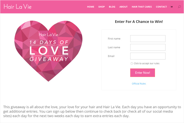

When I first land on the page, the nicely designed heart with the title of the promotion is the first thing that catches my eye.
I spot the entry form on the right-hand side, and I begin scanning the page to try and find out what the promotion is for.
It is telling me, “Enter For A Chance to Win!” but what can I win?
Mistake #1: The value proposition is below the page fold
This is a critical mistake that can cause a lot of people to bounce from the page. I’m looking at this promotion on both a 24” and 27” monitor, and I cannot see the prizes on my 24” screen, but I can see some of them on my 27” screen.
Most people will be visiting this on much smaller screens (11-15″ laptop screens), so they will not see the prizes unless they scroll the page.
The value proposition is one of the most important pieces to any sweepstakes or contest because what you are giving away is a major factor in determining how well your promotion will succeed.
By hiding the value proposition further down the page, it is not immediately clear to people what they can win, which will lower conversions.
Solution #1: Move the value proposition to the top of the page
The value proposition needs to be prominent, and it should be one of the first things people see when they land on your promotion.
Hair La Vie can fix this in their promotion by moving their prize list above the fold. The big heart can be moved elsewhere on the page or used as a watermark in the images.
Here is what an updated version could look like:
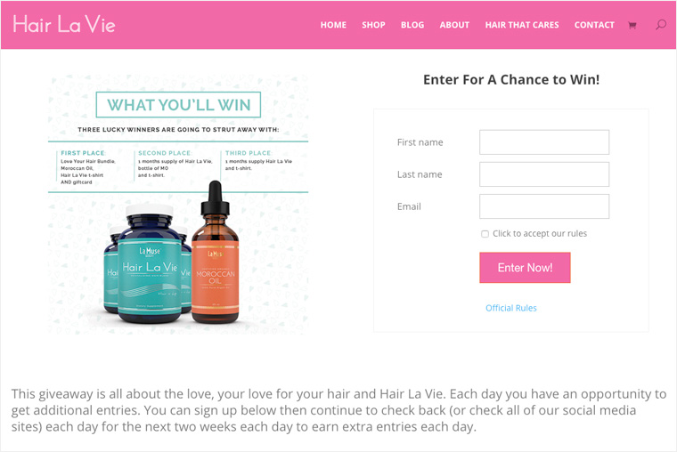

With this simple revision, it is immediately clear to any user visiting the page what they can win, but most importantly, what Hair La Vie is all about.
Without this, I have no idea who this company is, or what products they sell without having to do some digging. Bottom line: people are lazy, make it easy for them to say yes to your product!
Entry Form
The entry form for this promotion is simple: first name, last name, and email address. I praise them for this, as I always preach to keep the barrier to entry low and to not ask for a ton of information.
The less information you require on the entry form, the better your conversion rate will be.
Mistake #2: Poor entry form validation
My only gripe with their entry form is when it comes to error validation. If I click ‘Enter Now’ without filling out the fields, it should return an error right on the entry form. This will provide a good user experience and make it clear to the user what errors they have made so they can fix them.
Instead, this entry form redirects to another page, with another form, which tells the user what errors they made. The URL of this page is also completely different.
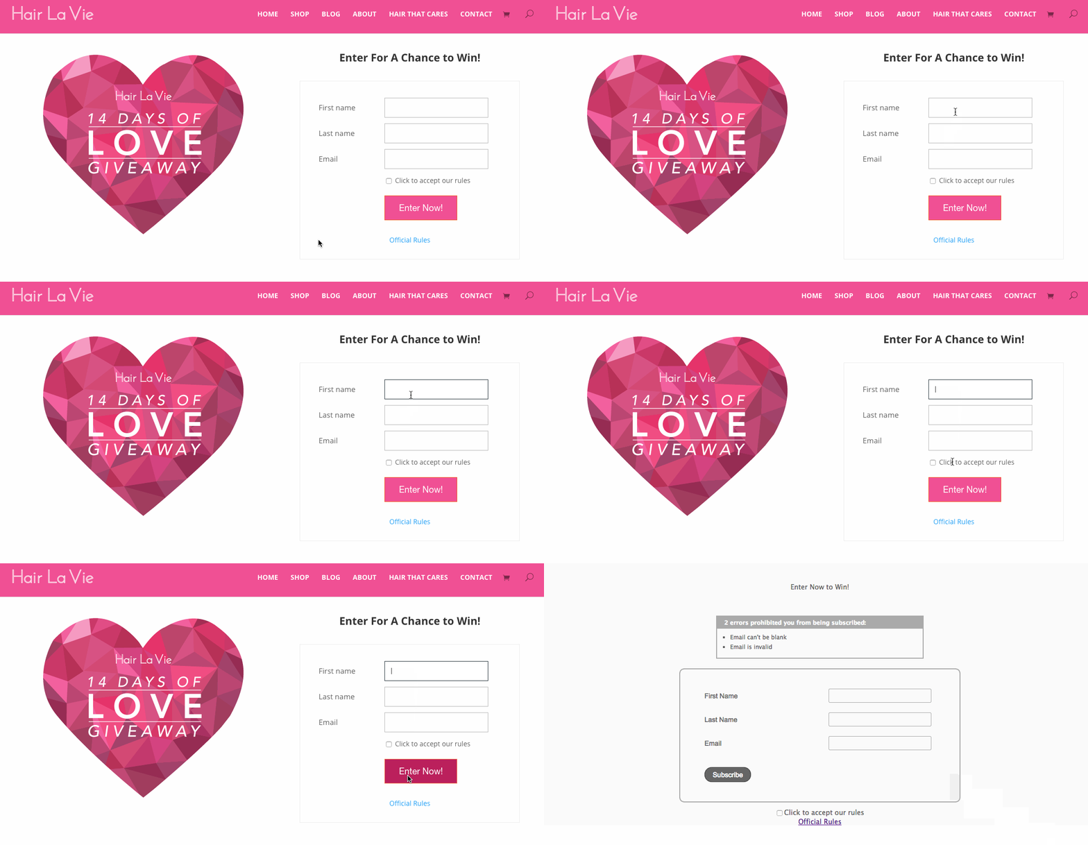

Some visitors will understand that this form was created through Hair La Vie’s email service provider; however, a typical user with less technical understanding may get turned off by this jarring error page and immediately close the browser window. Conversion lost.
Solution #2: Use a form that has proper validation
While using a different form may not be ideal for Hair La Vie, it can make all the difference between getting an entry and losing an entry.
There are plenty of services they could use to generate quality forms, like Wufoo, Cognitoforms, Typeform, and Google forms.
In addition, these services can also be tied into email service providers through an API, so information can automatically pass from the entry form into your email list.
Post Entry
After successfully completing the form, I get redirected to this thank you page:
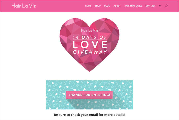

This is a simple thank you page; the only change I would make is to move the “Thanks for entering” above the heart graphic.
This will make it immediately clear to the user that their entry has been confirmed….or has it? This page is telling me to check my email for more details.
Mistake #3: Entry confirmation is not clear
I check my inbox, and I see the email come in. The subject line is: “Psst, Please Confirm Your Giveaway Entry!”. I click to open it, and this is what I see:
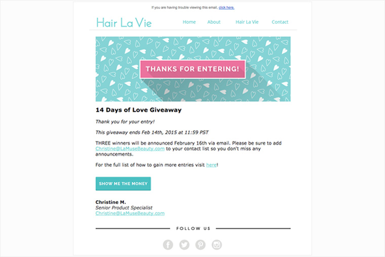

The subject line of the email is confusing because the entry form said, “Thanks for entering…Be sure to check your email for more details.” It did not say, “Check your email to confirm your entry.”
What if I didn’t check my email, am I still entered?
The email I received says, “Thank you for your entry”, and then there is a button further down that says, “Show me the money”. This button just redirects me to the giveaway, so it doesn’t look like my email address needed to be confirmed.
I’ll assume the subject line of the email was purposely misleading to get me to click, which could easily confuse people and lead to frustration. This may also cause people to email the company asking if they were really entered.
Remember, the purpose of running a promotion is to entice people into becoming customers and fans of your business—the last thing you want to do is deceive them, even if unintentionally.
Solution #3: Make it clear that an entry has been received
In this case, all Hair La Vie needs to do is change their wording to make it clear to users that they are entered, and no further effort is required.
Since it does not appear that users actually need to check their email to confirm their entry, Hair La Vie should adjust the wording on their thank you page as well as in their email subject line.
For the thank you page, they should change:
“Thanks for entering…Be sure to check your email for more details.”
to…
“Thanks for entering…Your entry is confirmed. Check your email for more details.”
The subject line of the email should be changed from:
“Psst, Please Confirm Your Giveaway Entry!”
to…
“Your Giveaway Entry is Confirmed.”
Bonus Entries
The bottom half of the landing page provides information about the promotion and how users can earn additional entries. They include an image of a calendar telling users which social channels can be leveraged for more entries each day of the promotion.
Today is February 5th, and the calendar tells me that I have to check out their Twitter today. I head on over to their Twitter page to claim my bonus entries, and it tells me that I have to retweet one of their posts to earn 5 entries:
Calling all 14 Days of Love #Giveaway lovers! Re-tweet our next post for your chance at 5 extra entries!
— Hair La Vie (@HairLaVie) February 5, 2015
Further down their page, I also see a post they made offering a chance to win $400 in prizes on their Instagram page:
Is this promotion on Instagram entirely separate from the one I just entered? Their Instagram post says to sign up from the link in their bio, so I click on the link, and it redirects me to the same giveaway page, so I’ll assume it is the same promotion.
How are they going to know to award 5 entries to me after I retweet their post?
Their calendar says that each daily task I complete is worth 5 extra entries, but how are they tracking this, and where do I see how many entries I have?
What if my Twitter account name is different than the name I entered their sweepstakes with…?
Mistake #4: Earning bonus entries is too confusing
I head on over to their Facebook page to investigate further, and I see that on February 3rd, they made a post that says you can get 5 extra entries for tagging a friend in a comment.
Again, I’ve already entered their sweepstakes, and the email I use on Facebook is different than the email I used to enter their sweepstakes.
I’ll give them the benefit of the doubt on this one, but it appears they are manually applying entries to people by matching up the names of people who left a Facebook comment to the names of the people that entered through their entry form.
To be honest, this is a lot of work, and there is a lot of room for error here.
Solution #4: Use an automated system to award bonus entries
There are many sweepstakes and contest solution providers like ViralSweep that Hair La Vie can use, which will automate the process of awarding bonus entries. In addition, users can easily check to see how many bonus entries they have rather than being left in information limbo.
An automated system also allows users to earn bonus entries right from the entry form, rather than having to remember to travel to a different social network each day to check that company’s post.
For example, through ViralSweep, users can earn additional entries for following a company on Twitter or Instagram.
The action of following right from the entry form allows brands to quickly grow their social audiences without requiring the user to jump through hoops (or convoluted calendar schemes).
Mobile Sweepstakes
Unless you’ve been living under a rock, you probably have heard that mobile usage has surpassed desktop usage, and there are now more people using mobile devices than desktop computers.
When it comes to promotions, this means users should be able to enter just as easily from their mobile phones as they can from their desktop computers. A promotion that is not optimized for mobile will result in a lot of lost entries. Just look at these numbers:
In 2013, traffic to promotions run through ViralSweep came from:
- 74% desktop
- 21% mobile
- 5% tablet
In 2014, traffic to promotions run through ViralSweep came from:
- 67% desktop
- 26% mobile
- 7% tablet
Our dataset is analyzing millions of visitors over thousands of promotions, and it shows that desktop usage is rapidly declining while mobile and tablet usage is going up.
In fact, some campaigns in our system have had a higher percentage of mobile visitors than desktop visitors.
Mobile is only going to get bigger, so make sure you are not neglecting mobile when it comes to running your campaigns.
Mistake #5: Entry form security error on mobile
I fired up the Hair La Vie promotion on my iPhone 6, running the latest version of iOS. Their promotion is responsive, which shows they care about their mobile users and make it easy for users to access the page from their phones.
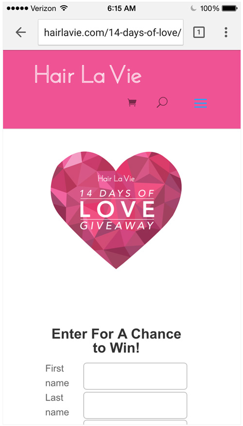

However, in Safari, when trying to enter the promotion, I got this warning:
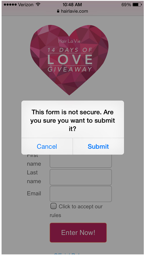

This happens because the entry form on their page is not being served over HTTPS, while the rest of the page is. It’s a simple fix, but it’s likely to have cost them several entries.
Solution #5: Test on multiple devices and browsers
It’s never enough to have a pretty-looking campaign that shows up properly on desktop, mobile, and tablet devices.
Always test your campaign on a variety of different devices and browsers before launching it to make sure there are no errors.
For example, I did not get that security error using Chrome on my iPhone, I only received the error in Safari. A few rounds of testing on multiple browsers and devices will help you avoid running into any problems while the promotion is live.
This concludes our first teardown. Hair La Vie has a solid promotion in place, and they only need to make a few small tweaks that will help improve this campaign dramatically.
Check out ViralSweep to run your next sweepstakes, and also follow us on Twitter.


